The New Shop is Winnipeg's oldest, operating restaurant. It opened in 1918 originally as a confectionary and has had several owners since.
When I started in November there were a few things I took note of that needed to change to give the place a bit of a boost, more pizzaz, if you will. The problem? I was new and far be it from me to waltz in and tell anyone how to run their business.
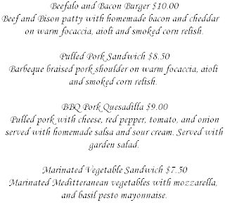
Just recently, I took it upon myself to redo the menus because, to be frank, they looked ridiculous. Someone went overboard with the serif font and borders:
I know what it's like to be married to a font, my personal favourite is Bookman Old Style, but the Monotype Corsiva just had to take a hike. The menus looked like they were made in 1992 and printed via a dot matrix printer.
I mustered up all the design knowledge that hadn't quite yet eluded me from first-year Electronic Publishing: Layout and Design and with what may or may not be a bootleg copy of Adobe InDesign, to put an end to the eyesore that was the old menu.
I'd like to think that the way a menu looks speaks volumes about the food it describes. If a menu looks like a big ol' mess then why would anything sound remotely appetizing.
Here's what I came up with:
Now is it the greatest menu design ever? Of course not. Does it look better than that doily we had before? I'd say so. Was everyone really impressed? Nope.
When I got the proofs printed it was like everyone in the building had a great idea on how to improve my design so I told them to "suck it"... with my mind.
I didn't take into consideration that I'd be hurting some feelings by re-doing the brutal menu and being so vocal about what an impediment it was on the restaurant but sometimes you've gotta be ruthless in this business.


